Choosing a front-door color for a grey house is more strategic than it appears. Grey siding can feel cool, warm, soft, or industrial, depending on its undertone. Your door must respond to that hidden temperature.
The question “How to choose a door color for a grey house” begins with observation. Study the siding beside a white card, brick step, and evening shadow. A blue-grey exterior may welcome charcoal, navy, or muted teal. A warm greige exterior often suits terracotta, olive, or deep brown. Test real paint samples on the door. Digital screens distort color badly.
Market evidence also offers useful guidance. Zillow’s 2022 Paint Color Analysis reported that homes with black front doors sold for approximately $6,449 more than expected. That finding does not guarantee a premium. Location, maintenance, and architecture still matter. The 2024 Houzz & Home Study also shows continued homeowner investment in exterior and outdoor improvements, reinforcing the door’s role in first impressions.
Designer Maria Killam famously calls the front door “the jewelry of the house.” The comparison is practical. A door adds the final accent, like a watch against a tailored coat. Yet bold is not always better. A glossy red door may energize pale grey siding, but overwhelm a narrow porch. A dusty green may look sophisticated in daylight and dull after sunset.
There is no universal winning shade. Sometimes the “perfect” color fails beside the roof. Paint two sample boards, view them at morning and dusk, and reconsider your first choice. The best decision feels intentional, not merely fashionable.
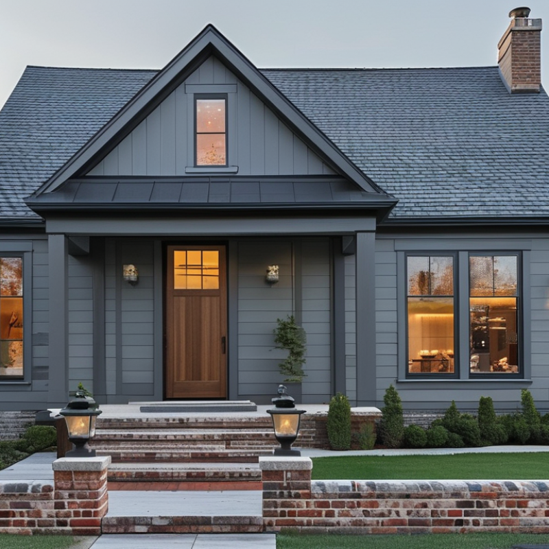
Choosing the best door color for a grey house starts with its undertone. Grey may look blue, green, beige, or nearly neutral. Check the exterior in morning, afternoon, and evening light. A blue-grey house often suits muted navy, charcoal, or deep green. Warm greys can handle earthy brown, clay, or soft cream.
Your home’s architectural style also matters. A traditional house may benefit from a rich burgundy or classic black door. A modern exterior can support warmer wood tones or a clean, saturated color. Look beyond the walls. Notice nearby trees, stone paths, fences, and seasonal flowers. A door that matches one summer plant may look disconnected in winter. I once trusted a small paint card too quickly, and the color appeared much brighter across the full door. That mistake changed how I test exterior colors.
Tips: Paint large sample boards instead of relying on tiny swatches. Place them beside the trim, porch floor, and grey siding. View them from the street, not only from indoors. Test both sunlight and shade. Consider the door’s material, because wood grain, metal, and fiberglass reflect color differently. If the surroundings already feel busy, choose a quieter shade. If the façade looks flat, a stronger door color can add depth. Still, personal taste should lead the decision. A technically suitable color may feel wrong when you enter the house.
How to Choose the Best Door Color for a Grey House 2026?
Match Door Colors to Light, Medium, or Dark Grey Exteriors
In my exterior color consultations, I match the door to the grey’s undertone first. A blue-grey exterior often suits deep navy, muted green, or clean charcoal doors. Warm light grey can handle natural wood, terracotta, or creamy white. These choices create contrast without making the entrance feel disconnected. Check the color outdoors.
For medium grey siding, consider burgundy, dusty blue, forest green, or warm stained wood. Medium grey offers flexibility, but nearby materials still matter. A brick path may support earthy reds, while cool stone can favor blue or black. I once selected a crisp black door for a medium-grey home. It looked elegant in the showroom, yet harsh beneath the house’s shaded porch.
Dark grey exteriors need careful balance. Soft white, pale blue, light oak, and warm beige can brighten the entry. A black door may disappear unless the trim or hardware adds contrast. Test large sample boards beside the door, not on a sunny wall. View them in morning, afternoon, and evening light. Five minutes is not enough. Matte finishes hide small surface flaws, while satin finishes reflect more light. Personal taste still matters, and color advice is not perfectly universal. A door facing dense trees may appear greener than expected. Recheck the choice after rain, when dark siding often looks deeper.
| Grey Exterior Type | Typical Light Reflectance Value (LRV) | Common Undertone | Recommended Door Colors | Visual Contrast | Best Finish | Why It Works | Design Considerations |
|---|---|---|---|---|---|---|---|
|
Light Grey
Grey facade
|
60–85 Reflects substantial daylight and usually appears spacious. |
Often cool blue, neutral, or slightly warm depending on the surrounding stone, roof, and trim. |
Navy
Charcoal black
Brick red
Medium wood
|
High | Satin or semi-gloss for a clear focal point; natural wood can use a low-sheen exterior finish. | Darker doors create definition against a pale facade, while red and wood tones add warmth without changing the wall color. | Use a cool navy or charcoal door with blue-grey siding. Choose red-brown or wood tones when the home has warm stone, brick, or brown roofing. |
|
Medium Grey
Grey facade
|
35–60 Provides a balanced base that can support either light or dark accents. |
Commonly neutral, blue-grey, green-grey, or warm greige. |
Soft white
Deep navy
Sage green
Terracotta
|
Medium to High | Satin is versatile for painted doors; use semi-gloss where stronger emphasis and easier cleaning are desired. | Medium grey exteriors are flexible, so the door can either brighten the entry or reinforce a darker, more contemporary palette. | Soft white works well with dark trim. Sage complements green undertones, while terracotta adds contrast to neutral or cool medium-grey walls. |
|
Dark Grey
Grey facade
|
10–35 Absorbs more light and can make an entry feel visually substantial. |
Often charcoal, blue-grey, neutral graphite, or green-grey. |
Warm white
Muted ochre
Deep red
Natural wood
|
High | Satin or semi-gloss for painted colors; a clear or tinted exterior wood finish helps preserve visible grain. | Lighter or warmer doors prevent the entrance from blending into the facade and improve visual wayfinding. | Warm white softens a cool charcoal exterior. Ochre and natural wood introduce warmth; deep red creates a traditional focal point. |
|
Blue-Grey Exterior
Blue-grey
|
25–65 The apparent value changes noticeably with daylight and nearby green landscaping. |
Cool blue or blue-violet. |
Warm white
Deep navy
Warm wood
Muted terracotta
|
Medium to High | Satin for a refined modern appearance; semi-gloss for a brighter, more noticeable entry. | Warm neutrals and wood balance the coolness of blue-grey, while deeper blue creates a coordinated monochromatic scheme. | Avoid overly icy whites if the facade already looks strongly blue. Test the color in both direct sun and shade before painting. |
|
Green-Grey Exterior
Green-grey
|
30–70 Can appear more green in natural surroundings and more neutral under overcast light. |
Olive, sage, or muted yellow-green. |
Creamy white
Natural wood
Rust red
Soft black
|
Medium to High | Satin for painted colors; a natural low-sheen finish is suitable for wood doors. | Cream, wood, and rust tones support the earthy undertone, while soft black gives the facade a sharper contemporary edge. | Coordinate with landscaping, natural stone, and roof color. Very bright primary colors may compete with the muted exterior. |
|
Warm Greige Exterior
Warm greige
|
45–75 Reflects moderate to high light while retaining beige warmth. |
Beige, taupe, or subtle yellow-red. |
Warm charcoal
Muted navy
Rust red
Walnut wood
|
Medium to High | Satin for most painted doors; semi-gloss can emphasize architectural detailing. | Warm greige pairs naturally with earthy, blue, and charcoal accents, making it one of the most adaptable grey-house palettes. | Compare the door with the trim and roof, not only the wall. Warm whites and brown woods usually harmonize better than stark blue-white shades. |
Planning note: LRV ranges are general design guidelines rather than exact measurements for every paint or cladding product. View a large exterior sample at different times of day, because sunlight, shade, landscaping, and surrounding materials can significantly change perceived color.
Grey siding changes noticeably under morning sun, cloudy skies, and warm porch lighting. Its undertone matters more than the paint label. Cool grey often suits blue, charcoal, or forest green doors. Warm grey can support muted terracotta, olive, or creamy beige.
Bold colors create a strong entrance. A deep navy door feels confident without becoming harsh. Burnt orange adds warmth, but it may compete with red brick or autumn landscaping. Rich green works especially well beside stone, timber, and black hardware. Use bold shades when the doorway needs visual focus. They can look smaller than expected on a shaded porch.
Neutral doors offer quieter balance. Soft taupe, greige, and warm white make a narrow entrance feel more open. However, a pale neutral may disappear against light grey siding. Classic choices remain dependable. Black provides crisp contrast, while deep brown brings a traditional, grounded character. I have found that black can feel severe on north-facing façades, despite looking elegant in photographs.
Place large samples beside the trim, steps, and roofline. Test them at different times. Small cards often mislead. My own mistake was trusting an evening sample; daylight exposed an unwanted purple cast. Check the color after rain, too. Reflections from wet paving can change the doorway’s appearance, and the “perfect” shade may need another look.
Choosing a door color for a grey house starts with the surrounding details, not personal preference alone. A grey exterior can feel cool, warm, modern, or surprisingly flat. Your trim helps define that mood. White trim creates crisp contrast, while cream or taupe trim softens the entrance. I have found that muted blue doors suit cool grey walls, while deep green or burgundy works better with warmer grey tones. View a large sample beside the trim before deciding.
The roof should guide the door’s depth and temperature. A charcoal roof can support black, navy, or dark green, but a lighter roof may need a softer contrast. Match the door hardware with nearby metal finishes, such as black, bronze, or brushed silver. These small details matter. Landscaping also changes the color’s appearance. Red flowers can make a green door feel stronger, while pale grasses may soften a dark entrance. I once chose a color that looked excellent alone but became harsh beside bright paving. That mistake still influences my testing process.
Tips: Test samples outdoors. Check them in morning and evening light. Stand several steps away. Repeat the check after rain. Avoid matching every element exactly; coordination needs slight variation. If the trim, roof, hardware, and plants compete, the doorway may lose focus. A restrained color often feels more considered, though not always more interesting.
How to Choose the Best Door Color for a Grey House 2026?
Test Your Color Choice in Different Lighting Before Painting
A grey house can make a door color appear cooler, darker, or brighter than expected. Natural light changes throughout the day. Light changes everything. Test your choice before opening a paint can. Paint two large sample boards, rather than a small square on the door. Small patches often hide subtle undertones.
Place the boards beside the entrance, trim, stonework, and nearby plants. Check them in early morning, strong midday sun, and evening shade. Also inspect them on cloudy days. A warm red may look welcoming in sunlight but surprisingly heavy near blue-grey siding. Deep green can feel balanced beside trees, yet almost black under a covered porch.
I once judged a sample too quickly and disliked it after sunset. That experience changed my process. I now leave samples outside for at least two full days. View them from the street, not only from close range. Photographing the boards can help, although phone cameras alter color slightly. Trust your eyes first.
Consider the door’s surface and condition. Glossy finishes reflect more light, while low-sheen finishes appear softer and conceal minor flaws. Before painting, clean the surface and check how the primer affects the color. A sample may seem perfect, but the final result can shift across different materials. Wait before deciding. Recheck the color after rain, when the grey siding may look deeper and more dramatic.
Test your color choice in different lighting before painting.
Contrast ratios are calculated from representative sRGB colors against medium-grey siding (#808080) using relative luminance. A higher ratio generally makes the door stand out more clearly, but the final appearance can change significantly with natural and artificial light.
Before painting, place large sample boards beside the grey exterior and check them in morning, afternoon, overcast, and evening conditions. Charcoal and black create the strongest contrast, while navy, forest green, and burgundy provide color with a softer visual transition.
: Grey siding may look cool, warm, or flat under changing light. Cool grey often suits muted blue, charcoal, or forest green. Warm grey can support olive, terracotta, or creamy beige. Light changes everything.
Deep navy creates a confident entrance without feeling overly harsh. Rich green pairs nicely with stone, timber, and dark hardware. Burnt orange adds warmth, but it may compete with red brick. Bold colors need space.
Soft taupe, greige, and warm white can make narrow entrances feel more open. A pale neutral may disappear beside light grey siding. Use stronger trim contrast when the doorway lacks definition.
Black offers crisp contrast and a clean appearance. Deep brown gives the entrance a grounded, traditional character. However, black may feel severe on a north-facing façade. Photographs can mislead.
White trim creates sharper contrast around the doorway. Cream or taupe trim produces a softer, warmer transition. Place a large color sample beside the actual trim before deciding.
They should coordinate, but exact matching can make the exterior feel forced. A charcoal roof can support black, navy, or deep green doors. Match door hardware with nearby black, bronze, or brushed-silver finishes. Small details matter.
Red flowers can make a green door appear stronger. Pale grasses may soften a dark entrance. Bright paving can make some colors look unexpectedly harsh. Plants are part of the color test.
Test large samples outdoors during morning and evening light. Check them beside the trim, steps, roofline, and paving. Look again after rain, when wet surfaces create strong reflections. I trusted an evening sample once. Daylight revealed a purple cast.
Choosing the right entrance color can transform the appearance of a grey home and create a more welcoming first impression. This guide explains How to choose a door color for a grey house by first identifying the exterior’s undertone, architectural style, and surrounding natural colors. It also considers how door shades work with light, medium, and dark grey siding, helping homeowners select a balanced look rather than relying on color trends alone.
The article compares bold, neutral, and classic door color families, from attention-grabbing shades to understated tones that create a calm, timeless appearance. It also explains how to coordinate the door with trim, roofing, hardware, walkways, and landscaping for a unified exterior design. Before painting, homeowners are encouraged to test sample colors in morning, afternoon, and evening light, since changing conditions can significantly affect how the color appears.

DCTan Door